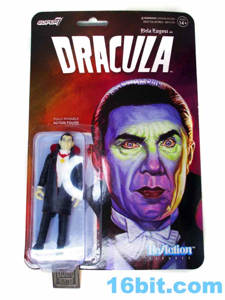
Super7 Universal Monsters Dracula Super7, 2018
Day #2,638: September 21, 2023
Dracula No one gives two f***s for Bela
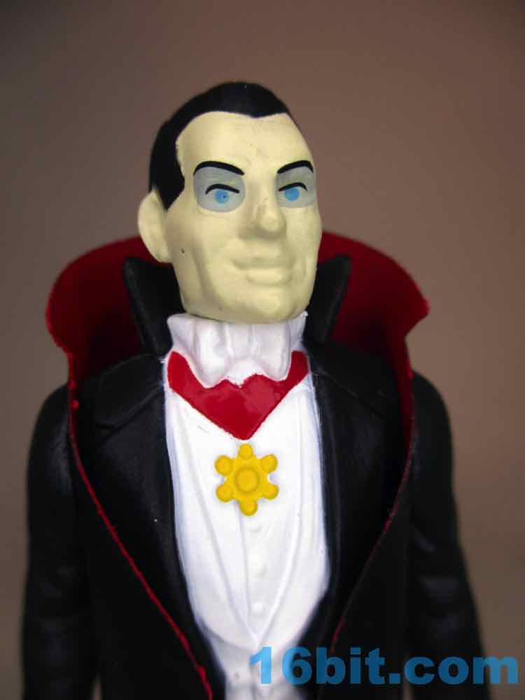
Universal Monsters ReAction Figure No. 03229 Manufacturer: Super7 Includes: Non-removable vinyl cape sandwiched under arms Action Feature: n/a Retail: $17.99 Availability: April 2018? Other: I hope it doesn't suck
PREVIOUS
RSS NEXT
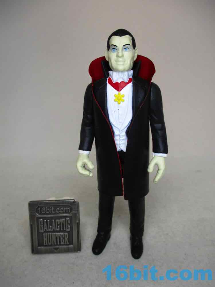
Dracula from Universal Monsters . I skipped him in 2018 and picked him up in 2023, originally because I was pretty happy with Funko's releases and didn't feel a burning need to upgrade. And now that I have him in hand? I think I was right, this isn't any worse, but it's not any better either. The two ReAction Draculas are two perfectly fine takes on what may well be the most famous public domain supernatural monster in recent history. The original one looks fine - and so does the new one. The eye paint on the new one and the thick skin paint are things I'd like to see changed, but otherwise he's quite charming.
Click here to check availability at Entertainment Earth
Click here to check availability at eBay
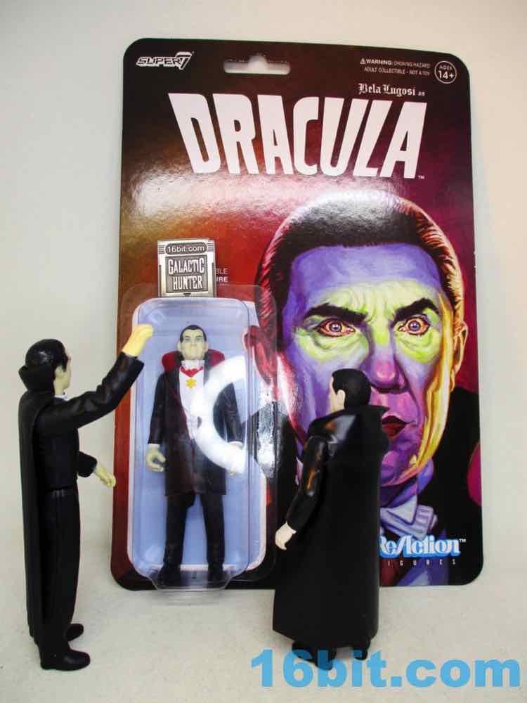
I thought the Dracula [FOTD #1,094] from 2014 did a nice job of pulling off the retro magic trick. Simple sculpting, limited deco, a bland but not awful pose, and a decent removable vinyl cape with thicker-than-usual vinyl. It got the job done well, with clean lines and there were some elements that were incredibly crisp on his torso.
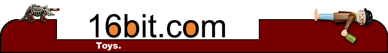
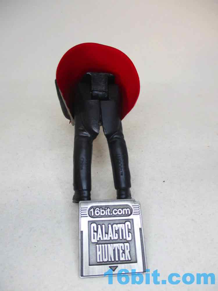
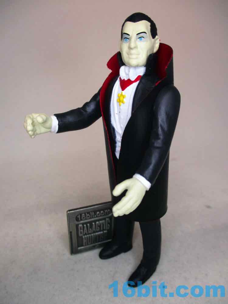
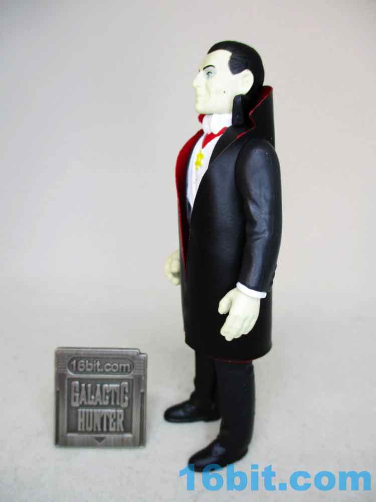
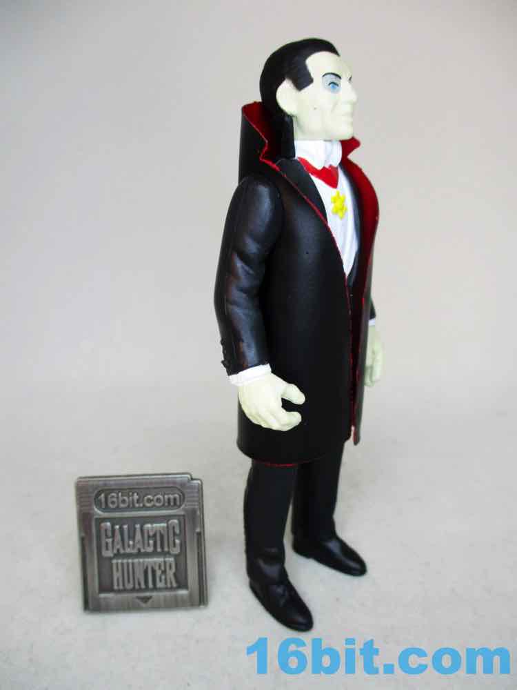
The 2018 Drac has much larger hands that are almost comically huge, but the pose is more Kenner-esque. The limbs swing freely and the head turns smoothly, giving him a better overall feel - but the cape isn't removable, so he won't be doing a lot of sitting. He stands well, and looks like a vampire. From some angles he looks like Bela Lugosi, but thanks to the blue eyes and painted pale skin he looks a little lumpier than need be. Sure, the real guy had a somewhat round face but this just doesn't feel right. I bet it has to do with the paint and materials more than the sculpt, but this isn't a character that's famous for blue eyes. His eyebrows don't seem particularly dynamic, but they're perfectly fine.
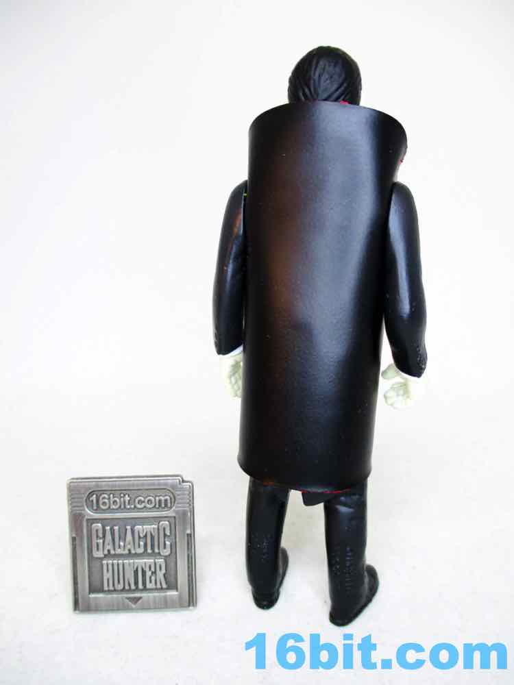
The sculptor did a nice job, as you can see near the ankles of his pants and the tails of his coat hidden under the cape. (See below for gratuitous butt shot.) The star pendant looks a little too round, but the waistcoat is fine and the buttons on hus chest are generally good. The details on the sleeves aren't quite as good as the Funko one, which I should note also had a fly sculpted on his pants.
His creepy smile is good, and the hair looks a lot like publicity photos. I don't think this was a "let's pretend it's Bela" sculpt but I'm just not feeling that this is the same guy who got attacked by his own octopus, or indeed the kind of guy who is pulling the strings behind some evil plot. It's close, and I would be interested in seeing if a repaint could improve it.
If I saw this in person before buying it, I'd probably have skipped it. I was super interested in getting more monster toys but I'm just not feeling that this is is worth getting if you open your figures and you already have a Dracula figure that makes you happy. The cape with the collar cut out was a great call on their part, and the red lining looks fantastic. But I can't remove it to see the figure's sculpt, and some nice work went on back there. This is by no means a bad figure, it's just that it shows it can be difficult to improve on a retro figure if an already perfectly-good retro figure is in your collection. Recommended for carded collectors, or at a discount, or possibly as a repaint if they make one with a repainted head some day.
--Adam Pawlus
Additional Images
See more Super 7 and Funko x Super 7 figures in Figure of the Day:Day 792: Super 7 ALIEN SDCC Exclusive Sales Samples Day 821: Super7 x Funko Alien ReAction Ripley Day 844: Super7 x Funko Alien ReAction Dallas Day 852: Super7 x Funko Alien ReAction Alien Day 857: Super7 x Funko Alien ReAction Kane in Space Suit Day 861: Super7 x Funko Alien ReAction Ash Day 945: Super7 x Funko The Rocketeer ReAction Rocketeer Action Figure Day 945: Super7 x Funko Predator (Invisible, Bloody) Action Figure Day 985: Funko Back to the Future Marty McFly ReAction Figure Day 1001: Funko Nightmare Before Christmas Jack Skellington (Early Bird Figure) ReAction Figure Day 1,005: Funko Universal Monsters The Mummy ReAction Figure Day 1,008: Funko Back to the Future George McFly ReAction Figure Day 1,008: Funko Back to the Future Doc Brown ReAction Figure Day 1,029: Super7 x Funko Predator (Attack Mode) ReAction Figure Day 1,037: Funko Nightmare Before Christmas Sally ReAction Figure Day 1,038: Funko Universal Monsters Creature from the Black Lagoon ReAction Figure Day 1,039: Funko Universal Monsters The Invisible Man ReAction Figure Day 1,040: Funko Universal Monsters The Phantom of the Opera ReAction Figure Day 1,041: Funko Universal Monsters The Wolf Man ReAction Figure Day 1,042: Funko Universal Monsters The Bride of Frankenstein ReAction Figure Day 1,059: Funko Predator (Masked) ReAction Figure Day 1,068: Funko Universal Monsters Frankenstein's Monster ReAction Figure Day 1,078: Funko Back to the Future Biff Tannen ReAction Figure Day 1,082: Funko T800 Endoskeleton (Chrome) ReAction Figure Day 1,094: Funko Universal Monsters Dracula ReAction Figure Day 1,059: Funko Predator (Masked) ReAction Figure Day 1,102: Funko Predator (Unmasked) ReAction Figure Day 1,108: Funko Universal Monsters The Invisible Man Day 1,108: Funko Universal Monsters The Invisible Man Clear Entertainment Earth Exclusive Day 1,111: Funko Predator (Glow Version) ReAction Figure Day 1,117: Funko The Terminator Sarah Connor ReAction Figure Day 1,133: Funko The Terminator (Tech Noir Jacket) ReAction Figure Day 1,138: Funko Pulp Fiction Mia Wallace ReAction Figure Day 1,149: Super7 x Funko Alien Egg Chamber Action Playset Day 1,183: Super7 x Funko Alien ReAction Alien (with Metallic Flesh) Day 1,187: Funko Predator (Invisible) ReAction Figure Day 1,199: Super7 x Funko Alien ReAction Ripley (Spacesuit) Day 1,208: Funko Predator (Thermal Vision) ReAction Figure Day 1,211: Funko The Fifth Element Leeloo ReAction Figure Day 1,217: Funko The Fifth Element Diva Plavalaguna ReAction Figure Day 1,222: Funko The Fifth Element Korben Dallas ReAction Figure Day 1,227: Funko The Fifth Element Mangalore ReAction Figure Day 1,236: Funko Gremlins Mogwai Stripe ReAction Figure Day 1,244: Funko The Fifth Element Ruby Rhod ReAction Figure Day 1,250: Super7 M.O.T.U.S.C.L.E. Set B Day 1,252: Funko The Fifth Element Zorg ReAction Figure Day 1,263: Super7 M.O.T.U.S.C.L.E. Set A Day 1,267: Funko The Fifth Element Leeloo (Straps Costume) ReAction Figure Day 1,272: Super7 x Funko Alien ReAction Kane (Chestburster) Day 1,275: Funko Gremlins Billy Peltzer ReAction Figure Day 1,277: Super7 x Funko Alien ReAction Kane (Facehugger) Day 1,286: Funko Nightmare Before Christmas Behemoth Day 1,288: Super7 M.O.T.U.S.C.L.E. Set C Day 1,295: Funko Nightmare Before Christmas Mayor Day 1,302: Super7 M.O.T.U.S.C.L.E. SDCC Promo Skeletor Day 1,327: Super7 x Funko Alien ReAction Nostromo Crew (Dallas, Kane, Lambert) Day 1,333: Funko Gremlins Cinema Gremlin ReAction Figure Day 1,342: Funko Gremlins Gremlin Stripe ReAction Figure Day 1,358: Funko Gremlins Bandit Gremlin ReAction Figure Day 1,628: Super7 Masters of the Universe M.U.S.C.L.E. Series 2 Set C Day 1,633: Super7 Masters of the Universe M.U.S.C.L.E. Series 2 Set B Day 1,637: Funko E.T. The Extra-Terrestrial Elliot, E.T., and Gertie ReAction Figures Day 1,639: Super7 Masters of the Universe M.U.S.C.L.E. Series 2 Set D Day 1,639: Super7 Masters of the Universe M.U.S.C.L.E. Series 2 Set A Day 1,656: Super7 Alien M.U.S.C.L.E. Set A Day 1,676: Super7 Alien M.U.S.C.L.E. Set C Day 1,686: Super7 Alien M.U.S.C.L.E. Set B Day 1,693: Super7 Alien M.U.S.C.L.E. Set D Day 1,801: Super7 Street Fighter II M.U.S.C.L.E. Set A Day 1,817: Super7 Street Fighter II M.U.S.C.L.E. Set B Day 1,834: Super7 Street Fighter II M.U.S.C.L.E. Set D Day 1,840: Super7 Masters of the Universe M.U.S.C.L.E. Series 3 Set D Day 1,846: Super7 Aliens M.U.S.C.L.E. Set E Day 1,843: Super7 Masters of the Universe M.U.S.C.L.E. Series 3 Set E Day 1,857: Super7 Street Fighter II M.U.S.C.L.E. Set C Day 1,862: Super7 Masters of the Universe M.U.S.C.L.E. Series 3 Set C Day 1,864: Super7 Aliens M.U.S.C.L.E. Set A Day 1,877: Super7 Masters of the Universe M.U.S.C.L.E. Series 3 Set F Day 1,881: Super7 Mega Man M.U.S.C.L.E. Series 1 Set B Day 1,884: Super7 Aliens M.U.S.C.L.E. Set D Day 1,894: Super7 Mega Man M.U.S.C.L.E. Series 1 Set D Day 1,904: Super7 Mega Man M.U.S.C.L.E. Series 1 Set A Day 1,914: Super7 Mega Man M.U.S.C.L.E. Series 1 Set C Day 1,920: Super7 Halloween Series Nosferatu Glow in the Dark Day 1,922: Super7 Masters of the Universe M.U.S.C.L.E. Series 3 Set B Day 1,937: Super7 Masters of the Universe M.U.S.C.L.E. Series 3 Set A Day 2,161: Super7 Masters of the Universe Transforming He-Man Action Figure Day 2,211: Super7 Toxic Crusaders Glow in the Dark Toxie Action Figure Day 2,235: Super7 Ultimates Voltron Action Figure Day 2,237: Super7 Teenage Mutant Ninja Turtles Ultimates Raphael Action Figure Day 2,253: Super7 Teenage Mutant Ninja Turtles Ultimates Foot Soldier Action Figure Day 2,358: Super7 Killer Bootlegs Rhamnusia's Revenge Action Playset with Draco Knuckleduster and Phantom Starkiller Action Figures Day 2,388: Super7 Teenage Mutant Ninja Turtles Ultimates Glow-in-the-Dark Mutagen Man Action Figure Day 2,454: Super7 Metropolis Silver Maria ReAction Figure Day 2,458: Super7 G.I. Joe Red Ninja ReAction Figure Day 2,465: Super7 Godzilla Godzilla '54 (Glow-in-the-Dark) ReAction Figure Day 2,480: Super7 Transformers Grimlock G2 ReAction Figure Day 2,526: Super7 Vincent Price Master of Mayhem ReAction Figure Day 2,530: Super7 Godzilla Mechagodzilla (Glow-in-the-Dark) ReAction Figure Day 2,534: Super7 Planet of the Apes Mendez XXVI ReAction Figure Day 2,546: Super7 Planet of the Apes Cornelius ReAction Figure Day 2,554: Super7 Alien UCCSS Nostromo Action Figure Set 1 with Kane with Facehugger, Ripley with Jonesy, Ash with Removable Head Day 2,562: Super7 Universal Monsters The Mummy ReAction Figure Day 2,570: Super7 Universal Monsters The Metaluna Mutant ReAction Figure Day 2,577: Super7 Transformers Hot Rod ReAction Figure Day 2,590: Super7 Planet of the Apes General Aldo ReAction Figure Day 2,594: Super7 Mars Attacks Destroying A Dog ReAction Figure Day 2,598: Super7 Planet of the Apes Dr. Zaius ReAction Figure Day 2,606: Super7 Universal Monsters Official World Famous Super7 Monsters! Creature from the Black Lagoon (Super She Creature) Glow-in-the-Dark Day 2,610: Super7 Planet of the Apes Taylor ReAction Figure Day 2,626: Super7 Planet of the Apes Zira ReAction Figure Day 2,630: Super7 Universal Monsters The Metaluna Mutant ReAction Figure Day 2,634: Super7 Planet of the Apes General Ursus ReAction Figure Day 2,638: Super7 Universal Monsters Dracula ReAction Figure Day 2,642: Super7 Star Trek: The Next Generation Armus ReAction Figure Day 2,647: Super7 Devo Whip It Mark Mothersbaugh ReAction Figure Day 2,649: Super7 Universal Monsters Bride of Frankenstein ReAction Figure Day 2,652: Super7 Universal Monsters The Mummy (Costume Colors) ReAction Figure Day 2,655: Super7 Planet of the Apes Nova ReAction Figure Day 2,657: Super7 Universal Monsters The Wolf Man ReAction Figure Day 2,659: Super7 Devo Satisfaction Bob Casale ReAction Figure Day 2,661: Super7 Svengoolie Horror Host Icon ReAction Figure Day 2,671: Super7 Vampira Dark Goddess of Horror Day 2,679: Super7 Planet of the Apes Gorilla Soldier (Hunter) Day 2,687: Super7 Sesame Street Yip Yip Martians Day 2,699: Super7 Dungeons & Dragons Sacred Statue Day 2,703 Super7 Planet of the Apes Gorilla Soldier (Patrolman) ReAction Figure Day 2,705 Super7 Devo New Traditionalists Gerald Casale ReAction Figure Day 2,724: Super7 Universal Monsters Creature from the Black Lagoon (Costume Colors) ReAction Figure Day 2,727: Super7 Star Trek: The Next Generation Wesley Crusher ReAction Figure Day 2,731: Super7 Star Trek: The Next Generation Dr. Beverly Crusher ReAction Figure Day 2,775: Super7 Universal Monsters The Wolf Man (Costume Colors) ReAction Figure Day 2,791: Super7 Devo Freedom of Choice Bob Mothersbaugh ReAction Figure Day 2,794: Super7 Sesame Street Oscar the Grouch Day 2,815: Super7 Universal Monsters Creature from the Black Lagoon ReAction Figure Day 2,820: Super7 Godzilla Titanosaurus '75 ReAction Figure Day 2,827: Super7 Universal Monsters Mole People ReAction Figure Day 2,831: Super7 Godzilla Monster Island Mystery Box Godzilla '62 ReAction Figure Day 2,836: Super7 Universal Monsters The Invisible Man ReAction Figure Day 2,839: Super7 Godzilla Monster Island Mystery Box Mechagodzilla '74 ReAction Figure Day 2,842: Super7 SilverHawks Quicksilver ReAction Figure Day 2,845: Super7 Universal Monsters Frankenstein ReAction Figure Day 2,848: Super7 Micronauts Baron Karza ReAction+ Figure Day 2,857: Super7 SilverHawks Mon*Star ReAction Figure Day 2,872: Super7 Universal Monsters The Mummy Ardath Bey ReAction Figure Day 2,884: Super7 Universal Monsters Son of Frankenstein ReAction Figure Day 2,887: Super7 Planet of the Apes Astronaut Cornelius ReAction Figure Day 2,899: Super7 Masters of the Universe Scare Glow ReAction Figure Day 2,902: Super7 Star Trek: The Next Generation Guinan Day 2,906: Super7 Transformers Gold Armor Bumblebee ReAction Figure Day 2,923: Super7 Universal Monsters Frankenstein's Monster (Costume Colors) Day 2,929: Super7 Devo Booji Boy ReAction Figure Day 2,941: Super7 Universal Monsters Creature from the Black Lagoon ReAction+ Figure Day 2,947: Super7 Micronauts Microtron ReAction+ Figure Day 2,958: Super7 Universal Monsters The Wolfman ReAction+ Figure Day 2,973: Super7 Universal Monsters The Dracula ReAction+ Figure Day 2,998: Super7 Alien UCCSS Nostromo Action Figure Set 2 Super7 Day 3,043: Super7 Micronauts Force Commander ReAction+ Figure Day 3,048: Super7 Spinal Tap Nigel Tufne ReAction Figure Day 3,063: Super7 Micronauts Time Traveler (Blue) ReAction+ Figure
See more Universal Monsters , Horror , and Monsters figures in Figure of the Day:Day 76: Diamond Select Toys Black and White Wolfman Day 777: Playmates Toys Monster Force Creature from the Black Lagoon Day 883: Burger King Universal Monsters Wolf Man Cellar Dweller Action Figure Day 894: Burger King Universal Monsters Down for the Count Dracula Day 924: Burger King Universal Monsters Bolts and Volts Frankenstein Day 931: Burger King Universal Monsters Scary Squirter Featuring the Creature from the Black Lagoon Day 1,000: Funko Hikari Vinyl Freddy Funko (Creature from the Black Lagoon) Day 1,005: Funko Universal Monsters The Mummy ReAction Figure Day 1,038: Funko Universal Monsters Creature from the Black Lagoon ReAction Figure Day 1,039: Funko Universal Monsters The Invisible Man ReAction Figure Day 1,040: Funko Universal Monsters The Phantom of the Opera ReAction Figure Day 1,041: Funko Universal Monsters The Wolf Man ReAction Figure Day 1,042: Funko Universal Monsters The Bride of Frankenstein ReAction Figure Day 1,068: Funko Universal Monsters Frankenstein's Monster ReAction Figure Day 1,094: Funko Universal Monsters Dracula ReAction Figure Day 1,108: Funko Universal Monsters The Invisible Man Clear Entertainment Earth Exclusive Day 1,163: Funko Universal Monsters Life Force Metaluna Mutant Day 1,165: Funko Hikari Vinyl Universal Monsters Glitter Shock Frankenstein Day 1,257: Funko Hikari Vinyl Antique Verdigris Metaluna Mutant Day 1,612: Hasbro Hero Mashers Monsters Fish Hook Day 1,617: Playmobil 6824 Playmo-Friends Werewolf Day 1,619: Hasbro Hero Mashers Monsters Grim Flame Day 1,626: Hasbro Hero Mashers Monsters Iron Vulf Day 1,636: Hasbro Hero Mashers Monsters Sir Jack-O-Lanternus Day 1,675: Hasbro Hero Mashers Monsters Bone Thrasher Day 1,920: Super7 Halloween Series Nosferatu Glow in the Dark Day 2,011: Jack in the Box Universal Monsters Bride of Frankenstein Day 2,104: Fisher-Price Imaginext Egypt Mummy Guards Action Figures Day 2,137: Sideshow Toy Universal Monsters Boris Karloff The Mummy Glow in the Dark Action Figure Day 2,412: Jada Toys Universal Monsters Entertainment Earth Exclusive Creature from the Black Lagoon Action Figure Day 2,454: Super7 Metropolis Silver Maria ReAction Figure Day 2,562: Super7 Universal Monsters The Mummy ReAction Figure Day 2,570: Super7 Universal Monsters The Metaluna Mutant ReAction Figure Day 2,606: Super7 Universal Monsters Official World Famous Super7 Monsters! Creature from the Black Lagoon (Super She Creature) Glow-in-the-Dark Day 2,630: Super7 Universal Monsters The Metaluna Mutant ReAction Figure Day 2,638: Super7 Universal Monsters Dracula ReAction Figure Day 2,649: Super7 Universal Monsters Bride of Frankenstein ReAction Figure Day 2,652: Super7 Universal Monsters The Mummy (Costume Colors) ReAction Figure Day 2,657: Super7 Universal Monsters The Wolf Man ReAction Figure Day 2,661: Super7 Svengoolie Horror Host Icon ReAction Figure Day 2,670: Hasbro Transformers Universal Monsters Frankenstein Frankentron Figure Day 2,671: Super7 Vampira Dark Goddess of Horror Day 2,681: NECA Toony Terrors Svengoolie Day 2,724: Super7 Universal Monsters Creature from the Black Lagoon (Costume Colors) ReAction Figure Day 2,775: Super7 Universal Monsters The Wolf Man (Costume Colors) ReAction Figure Day 2,815: Super7 Universal Monsters Creature from the Black Lagoon ReAction Figure Day 2,827: Super7 Universal Monsters Mole People ReAction Figure Day 2,836: Super7 Universal Monsters The Invisible Man ReAction Figure Day 2,845: Super7 Universal Monsters Frankenstein ReAction Figure Day 2,872: Super7 Universal Monsters The Mummy Ardath Bey ReAction Figure Day 2,884: Super7 Universal Monsters Son of Frankenstein ReAction Figure Day 2,923: Super7 Universal Monsters Frankenstein's Monster (Costume Colors) Day 2,941: Super7 Universal Monsters Creature from the Black Lagoon ReAction+ Figure Day 2,958: Super7 Universal Monsters The Wolfman ReAction+ Figure Day 2,973: Super7 Universal Monsters The Dracula ReAction+ Figure